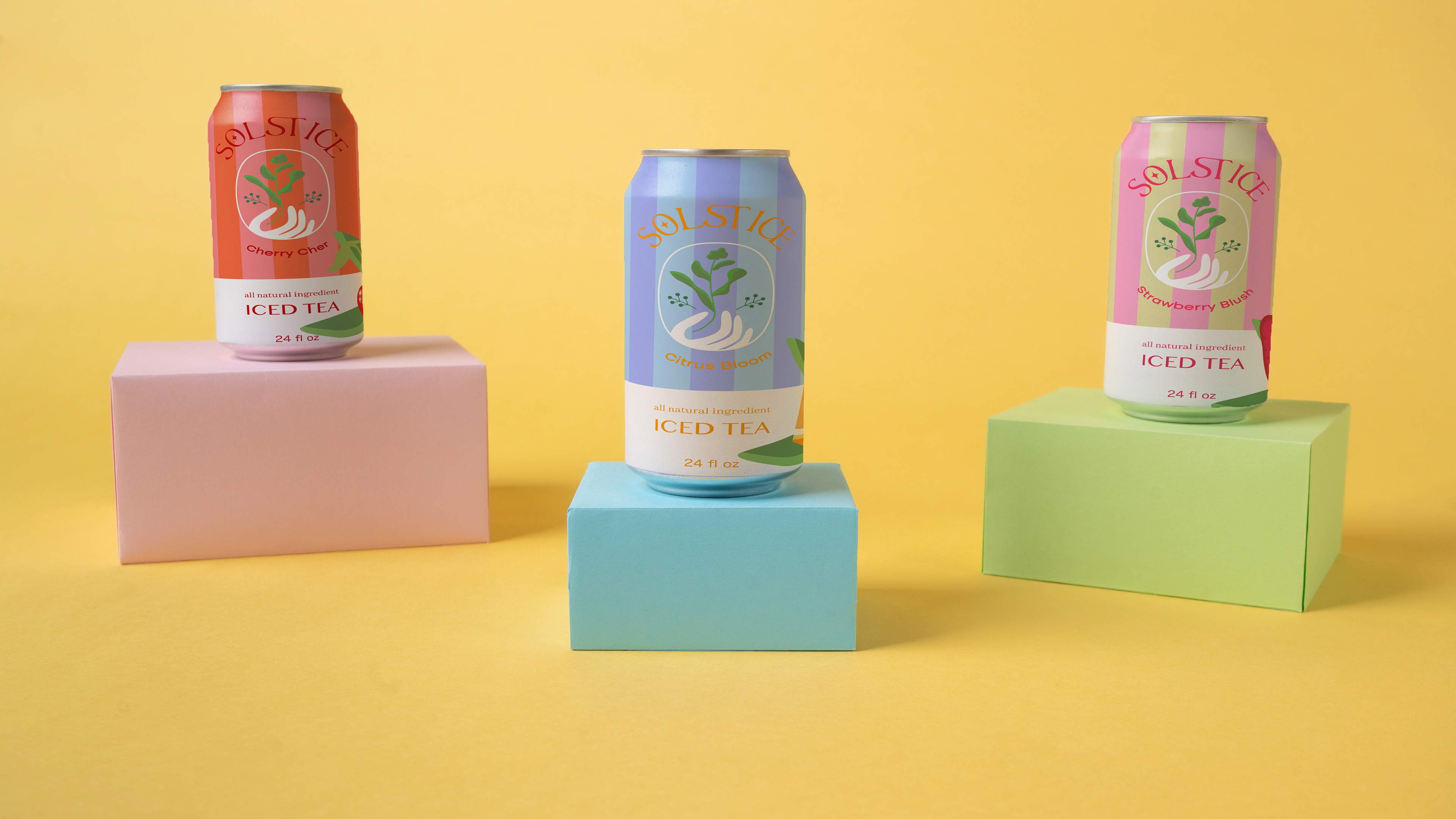
Echo
Beverage
PROJECT OVERVIEW
This magazine is centered around indie bands and emerging music culture, capturing the raw creativity and individuality of the scene. The design reflects that spirit through a modern yet bold approach—featuring striking typography, high-contrast visuals, and vibrant, unconventional color choices that immediately grab attention.
The layout feels fresh and dynamic, blending clean structure with expressive elements to mirror the energy of indie music. It’s designed to stand out on a shelf—visually compelling and intriguing—something that naturally draws you in and makes you want to pick it up, flip through, and discover new sounds.
SOFTWARE FONTS PERSONALITY
Illustrator Aesthetic Regular Healthy
Photoshop Bacute Regular Aesthetic
Lightroom Hoefler Text Vibrant
Altone Trial
